Enter Password
Payment Bottom Sheet
Payments Core
Year
2024-25
Type of Project
Payment Core
Company
PhonePe Pvt Ltd
Worked as
Lead Product Desginer
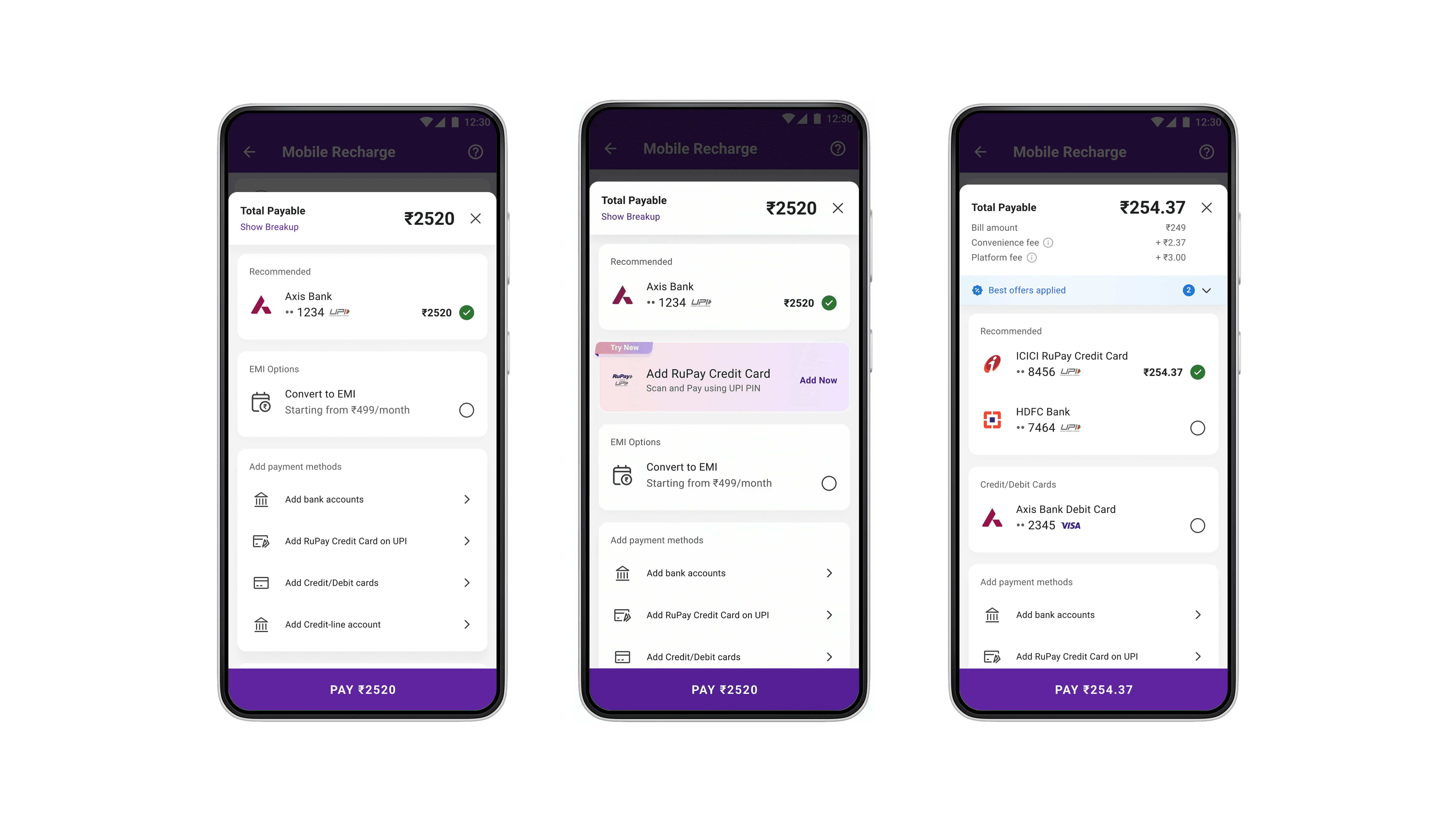
Case Study
Summary
With the introduction of new instruments on UPI and the planned launch of PhonePe instruments such as EMI, BNPL, RuPay Credit Cards, and UPI Lite, the existing payment bottom sheet was no longer designed to scale.
The pay page needed to evolve from a static list into a decision-making system that could:
Promote revenue-contributing instruments
Drive adoption of new instruments
Optimize market share where required
Stay fast, familiar, and uncluttered despite growing complexity
Problem Space
The challenge was to redesign the payment bottom sheet so it could:
Push adoption of new revenue-positive instruments
Increase usage of existing contributors (e.g. RuPay CC)
Optimize for market share (e.g. UPI Lite)
Remain decluttered and predictable as instrument count increased per user
This was not a visual redesign alone, it was a logic, behaviour, and systems problem operating in a high-frequency, low-attention moment.
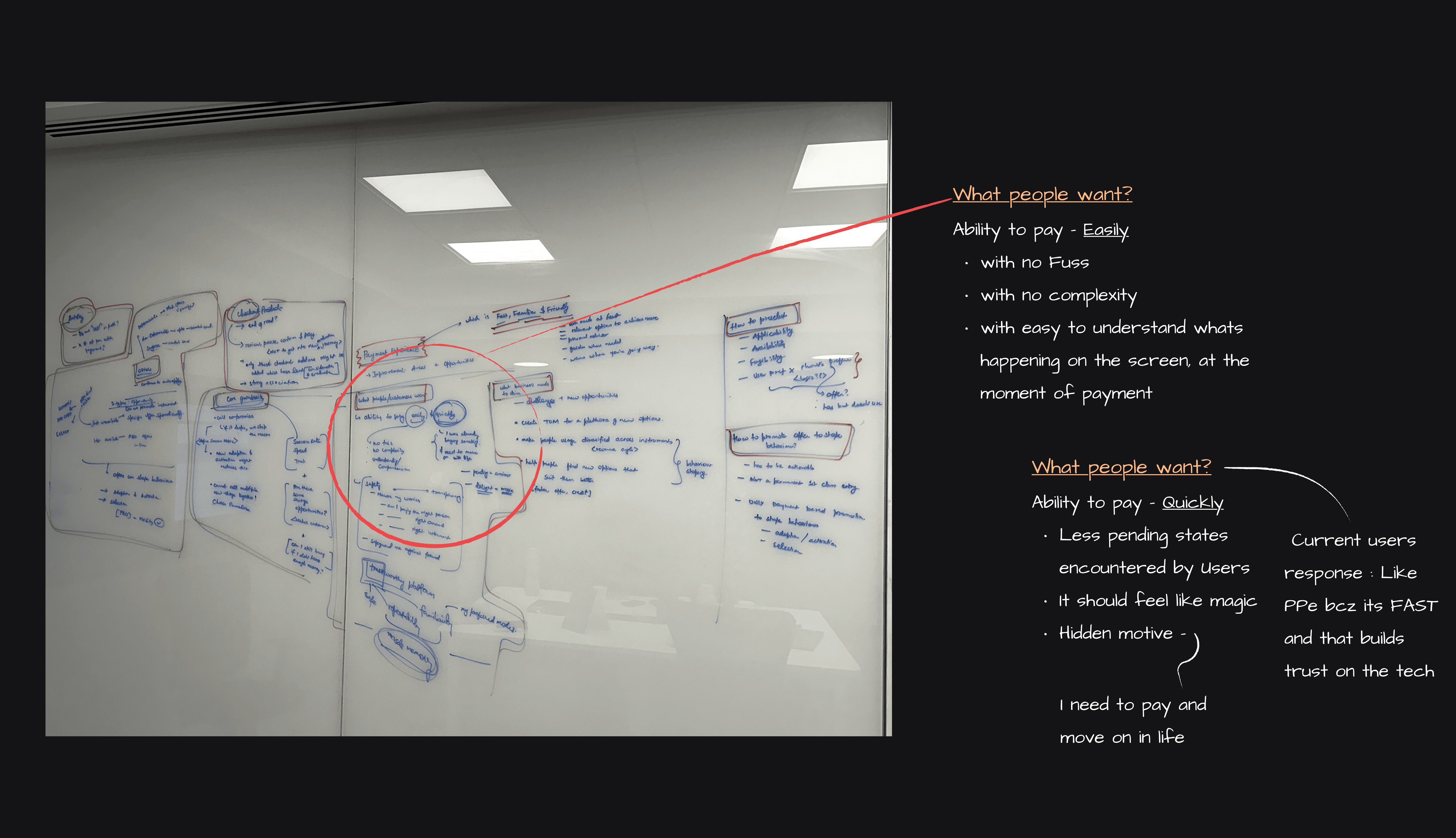
User Behaviour & Mental Models
From historical behaviour and internal analysis:
How users behave while paying
Payments are muscle-memory driven
Users do not want to compare instruments mid-flow
Speed and success matter more than exploration
Too many options lead to hesitation or drop-off
What users expect
Familiarity
Trust and safety
Transparency only when required
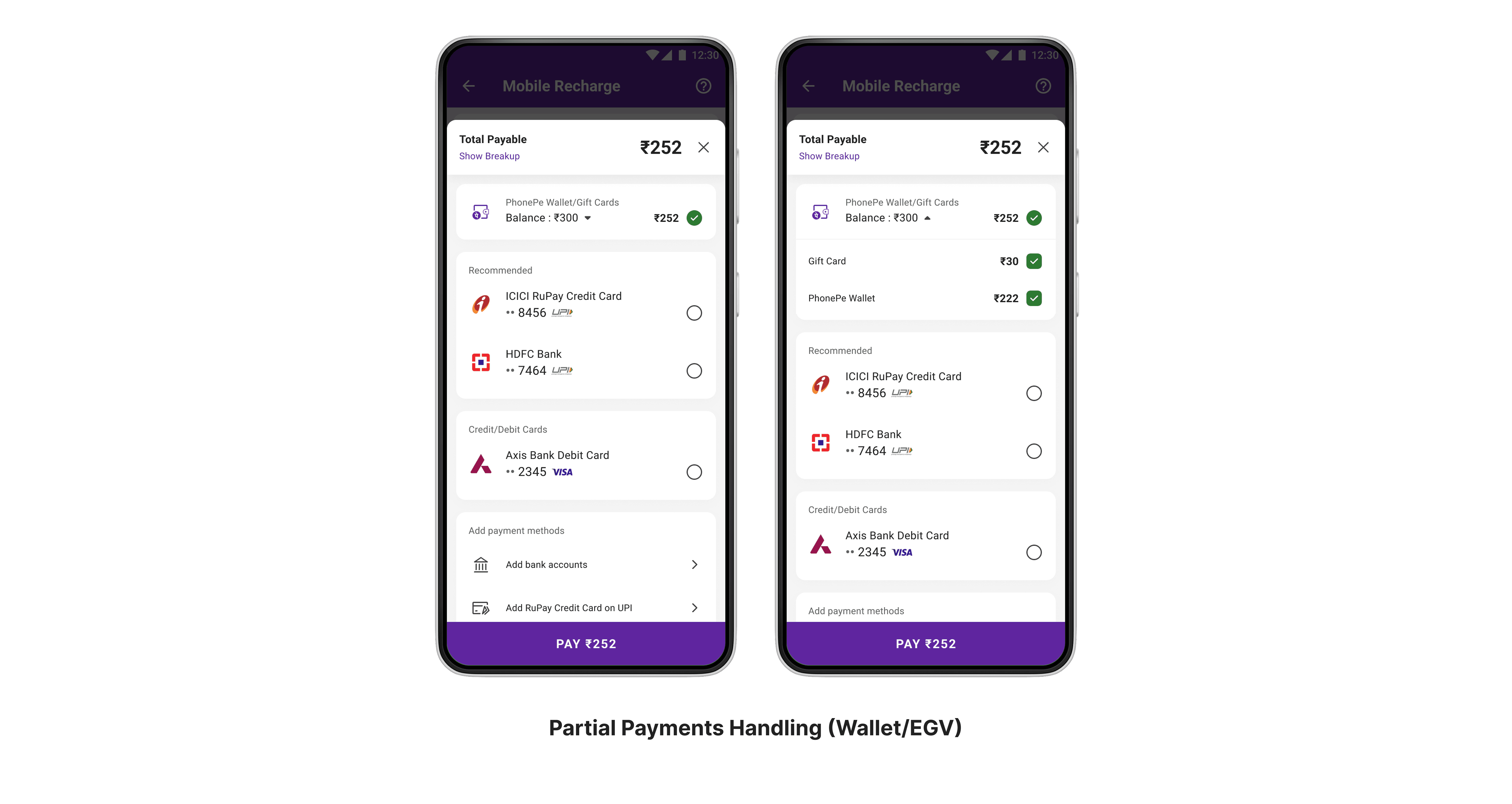
Ability to complete payment even with limited balance
These insights shaped a core principle:
Reduce decisions. Curate choices. Default intelligently.
Constraints & Guardrails
Constraints
Payment speed could not degrade
Instrument selling must avoid choice paradox
Driven logic (applicability, availability, fungibility) had to power UX
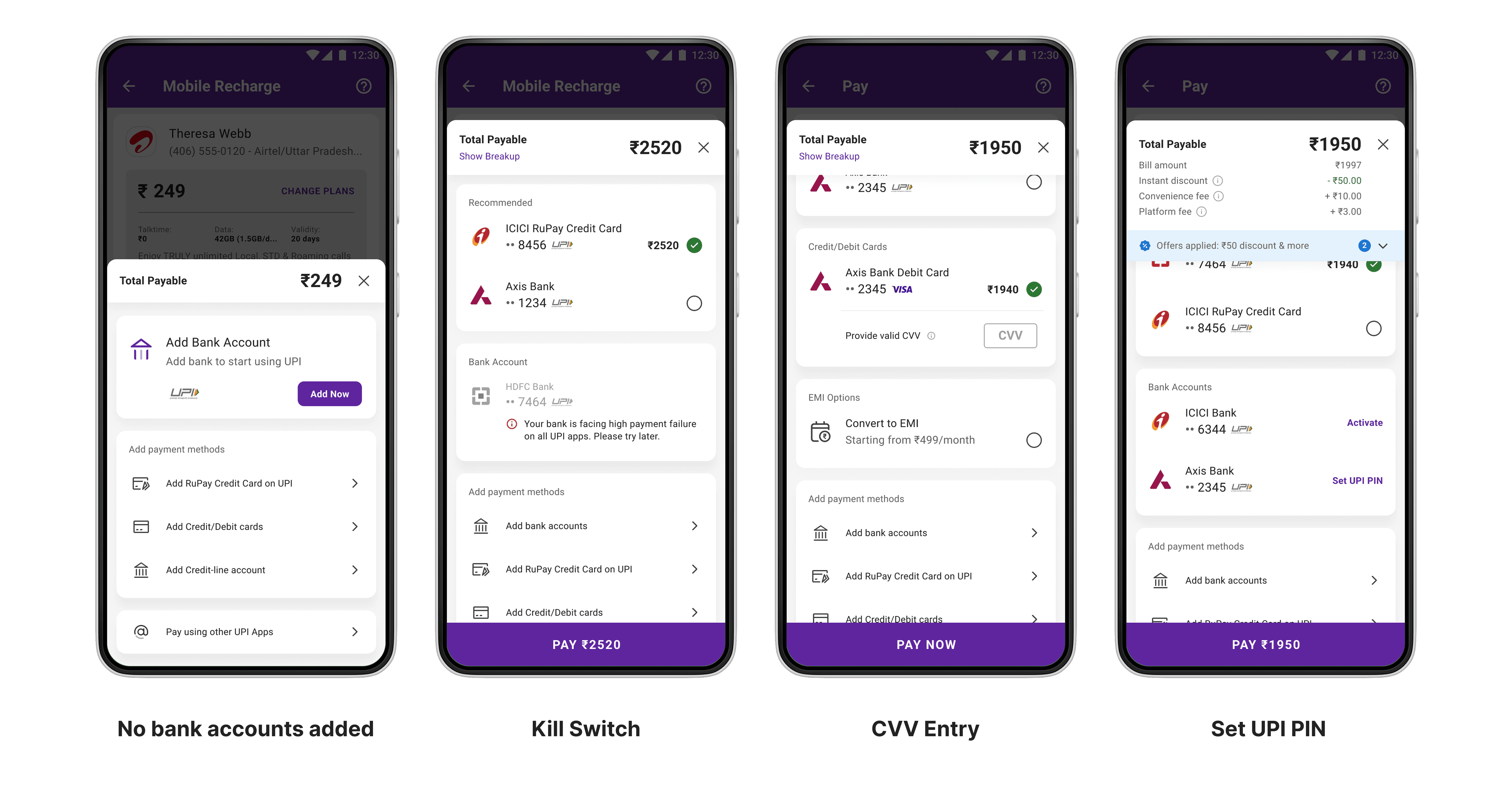
System had to support fallback and partial availability
Non-Goals
No deep education during payment
No disruptive UI changes
No new payment categories
This ensured the redesign stayed evolutionary, not disruptive.
Design Approach
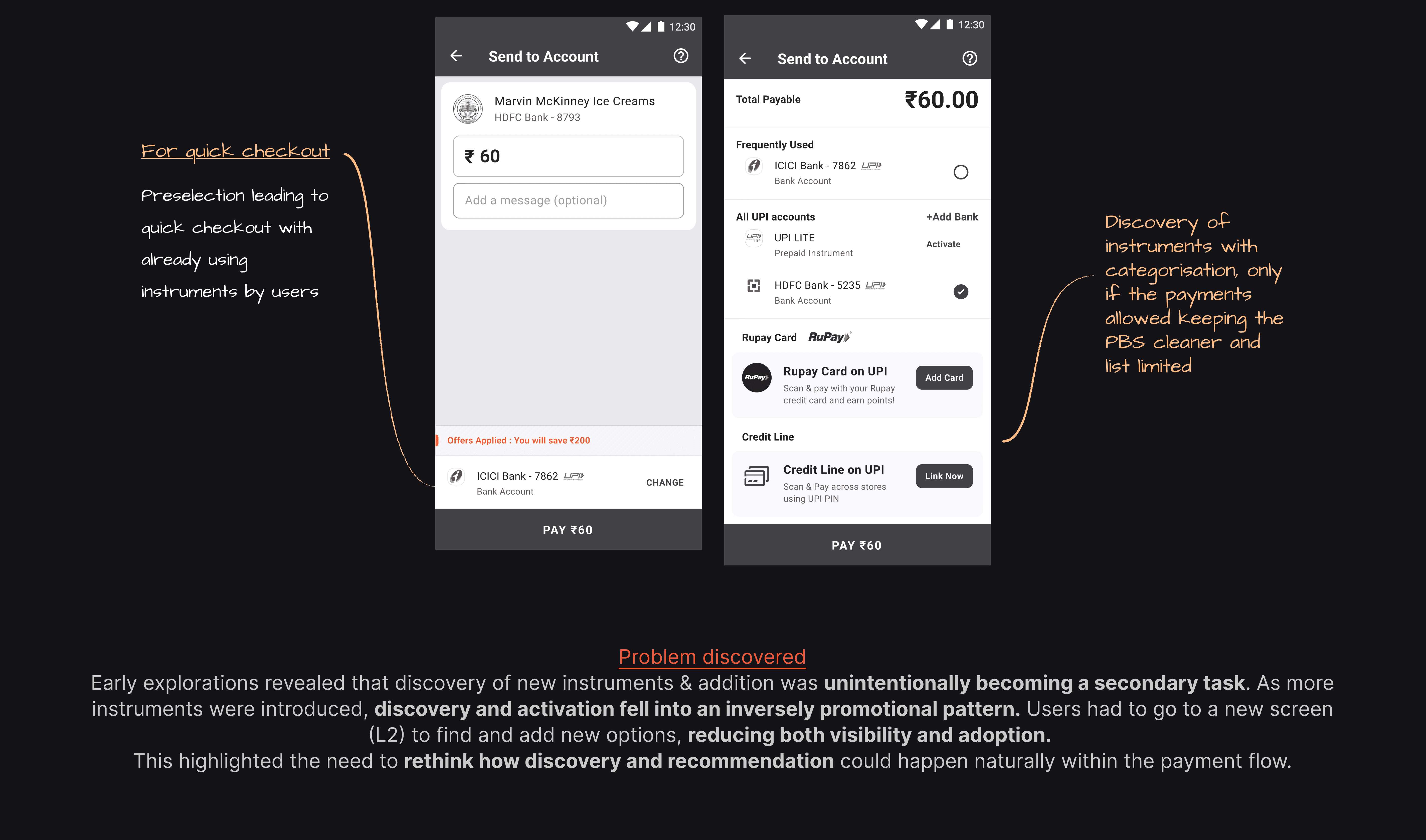
Early explorations tested allowing users to:
Pay directly from checkout
Switch instruments via a secondary (L2) page
However, feedback showed:
Discovery of new instruments would remain weak
Wallets, new instruments, and offers would not surface clearly
Activation would stay low if buried deeper in the flow
This led to a shift:
Discovery and recommendation had to happen inside the payment moment itself.
System Design Overview
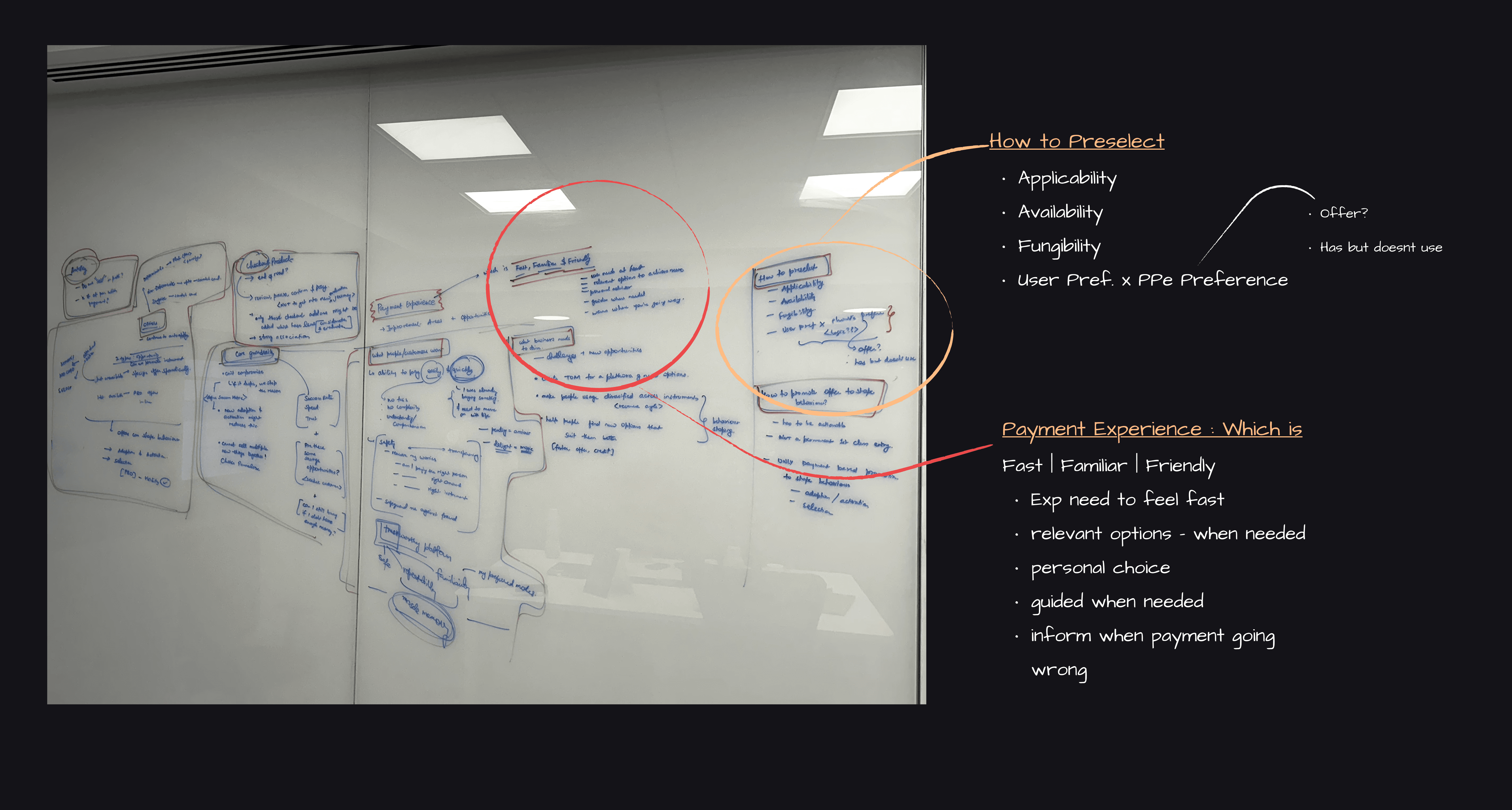
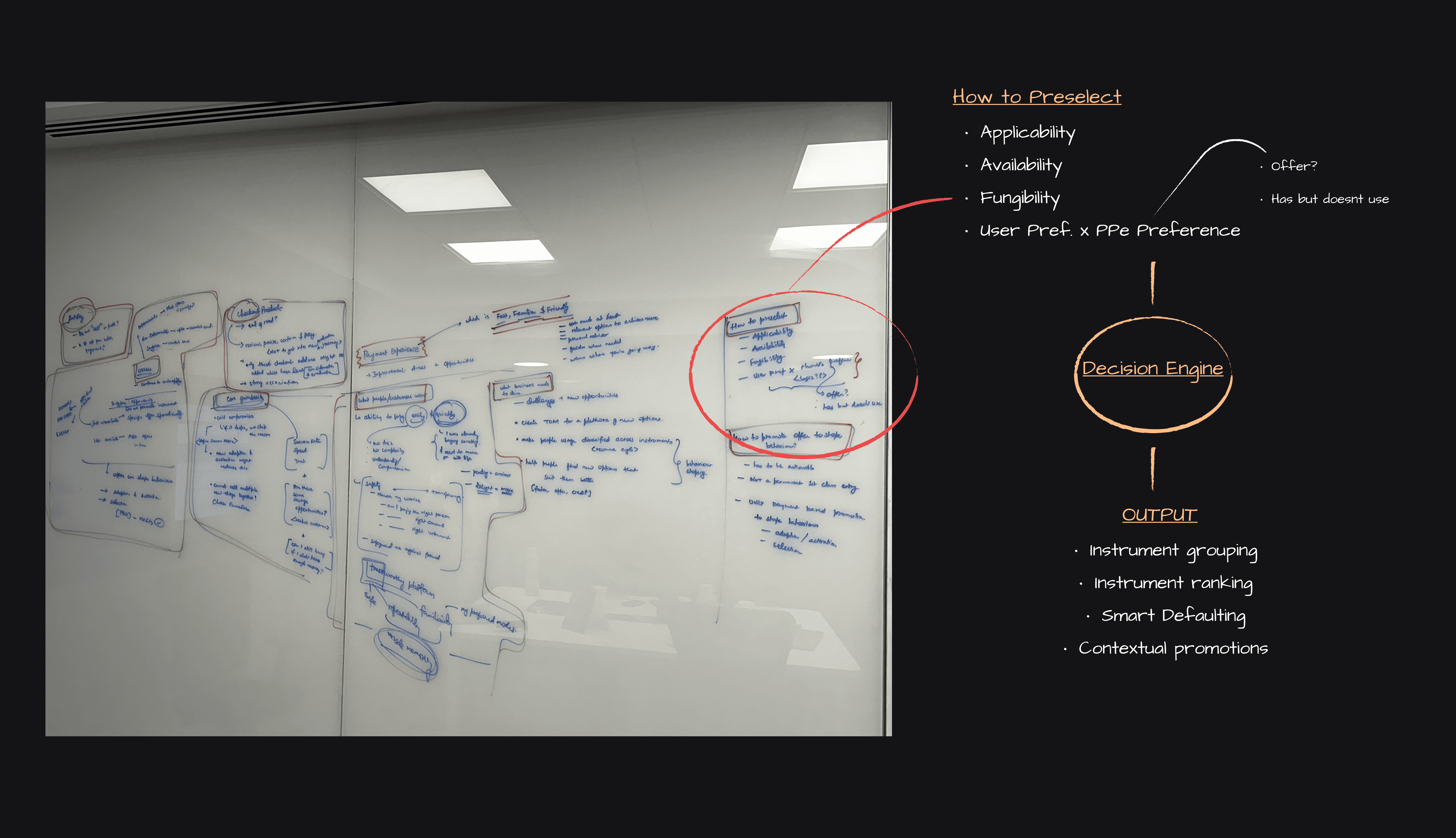
The redesigned pay page became a policy-driven system, not a static list.
Inputs considered
Applicability
Availability
Fungibility
User preference
PhonePe preference (revenue, adoption, offers)
System outputs
Instrument grouping
Instrument ranking within groups
Smart defaulting
Contextual promotions
Key Decisions
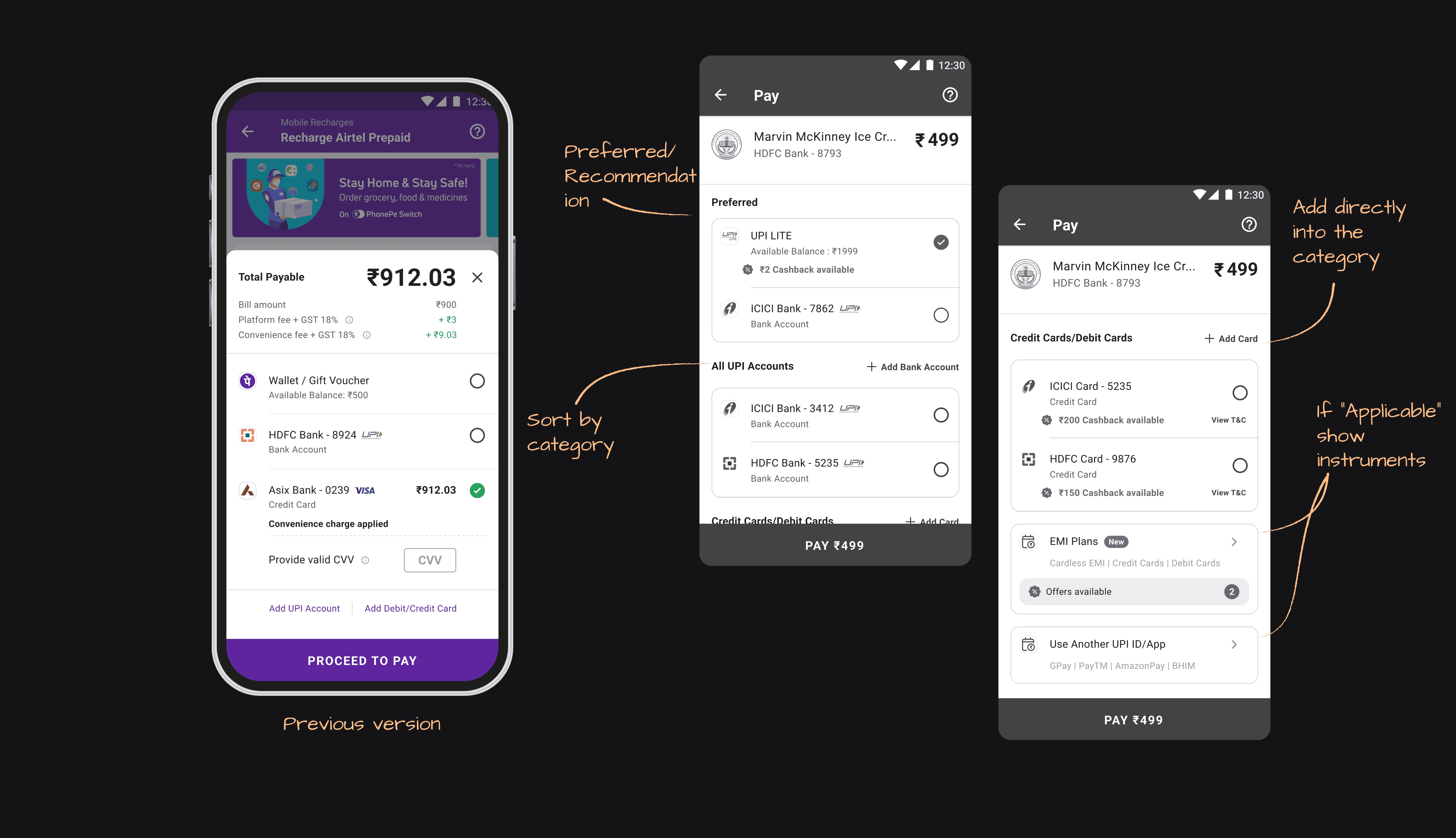
Decision 1 : Grouping Instruments
Instruments were grouped to:
Reduce cognitive load
Improve scan-ability
Maintain predictable structure as instruments scale
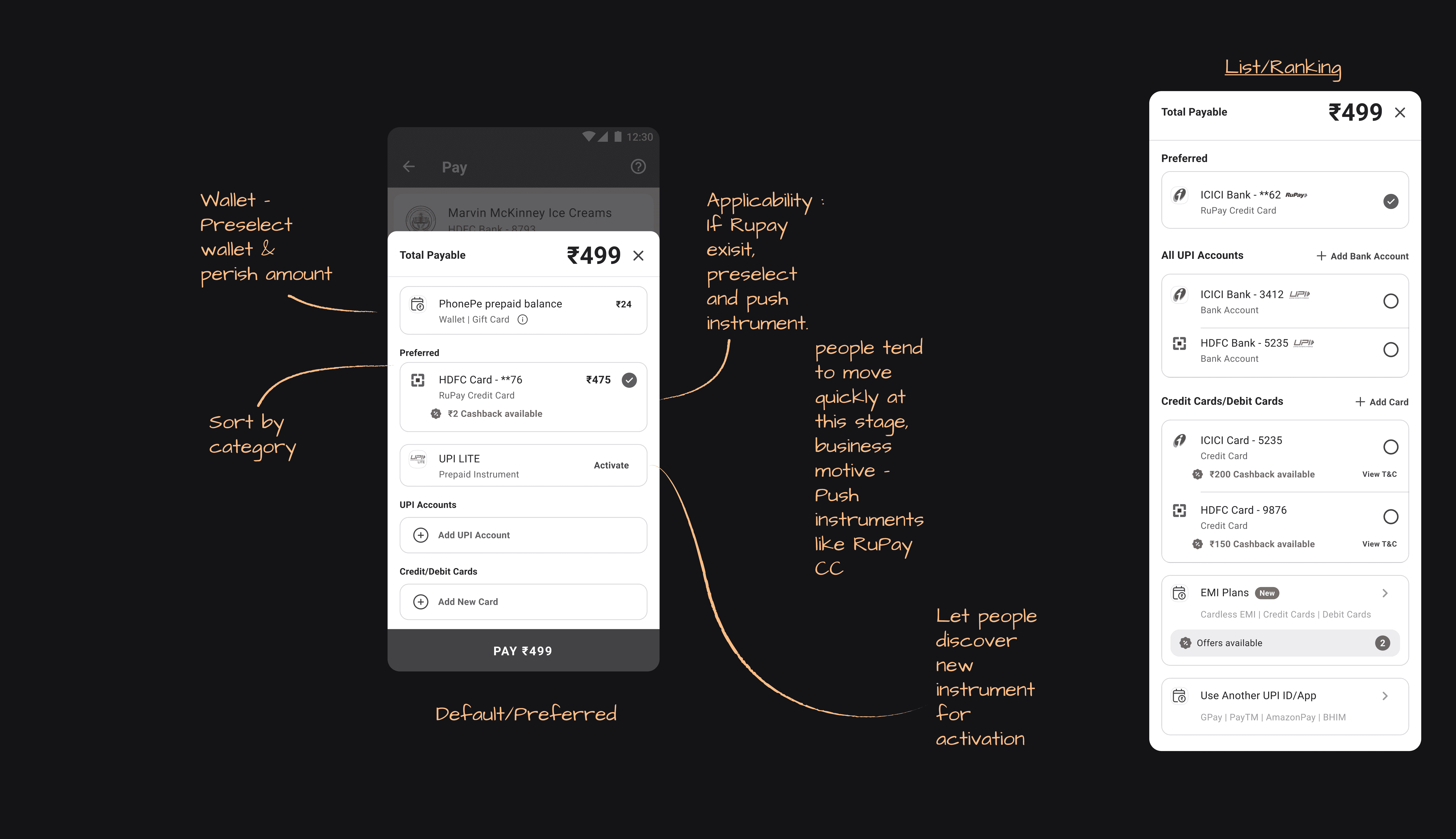
Decision 2 : Ranking Over Selection
Instead of asking users to choose, instruments were ranked and defaulted based on usability and priority.
This leveraged prior learnings from RuPay CC defaulting experiments and reduced decision friction.
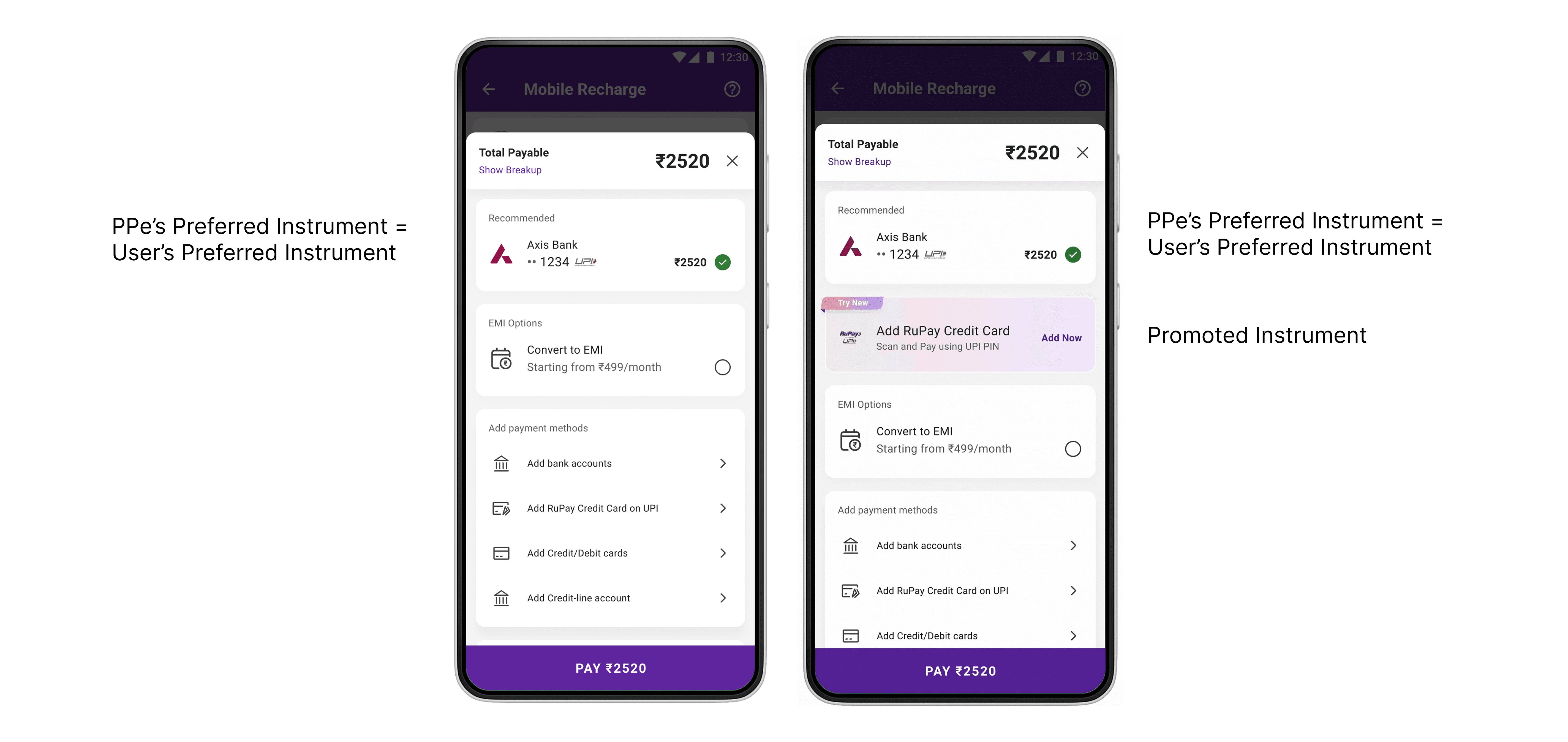
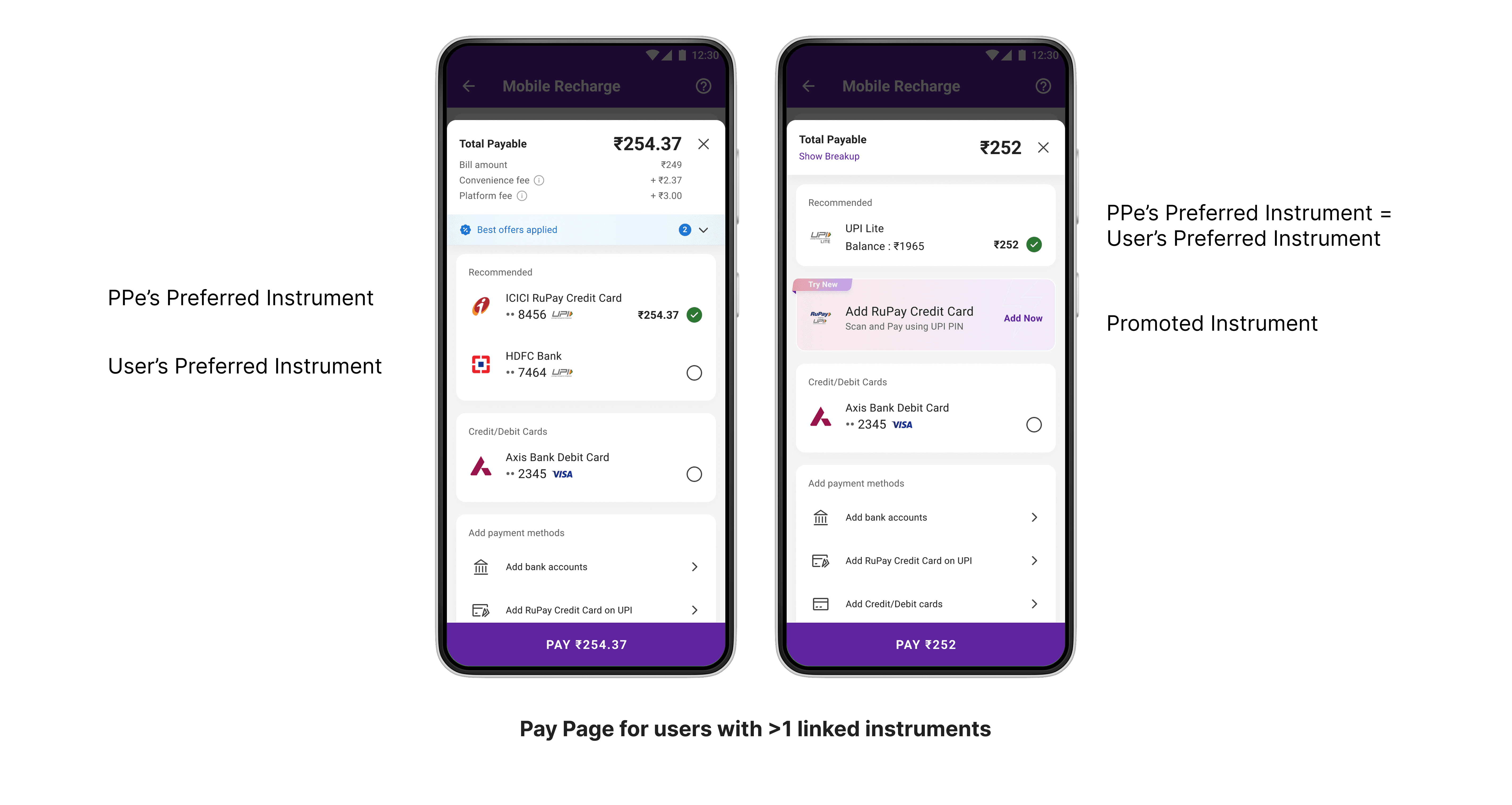
Decision 3 : Introducing a “Recommended” Group (Deep)
A new Recommended group surfaced:
The user’s preferred instrument
PhonePe’s preferred instrument
This balanced:
User trust
Business goals
Minimal cognitive effort
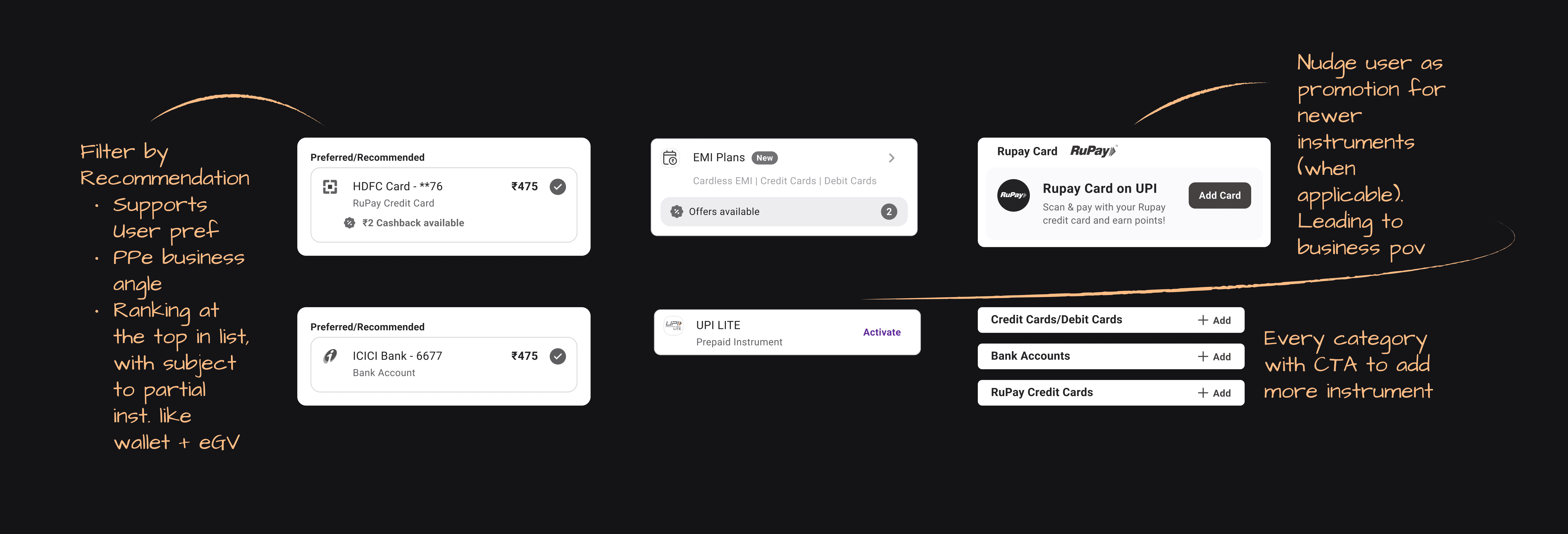
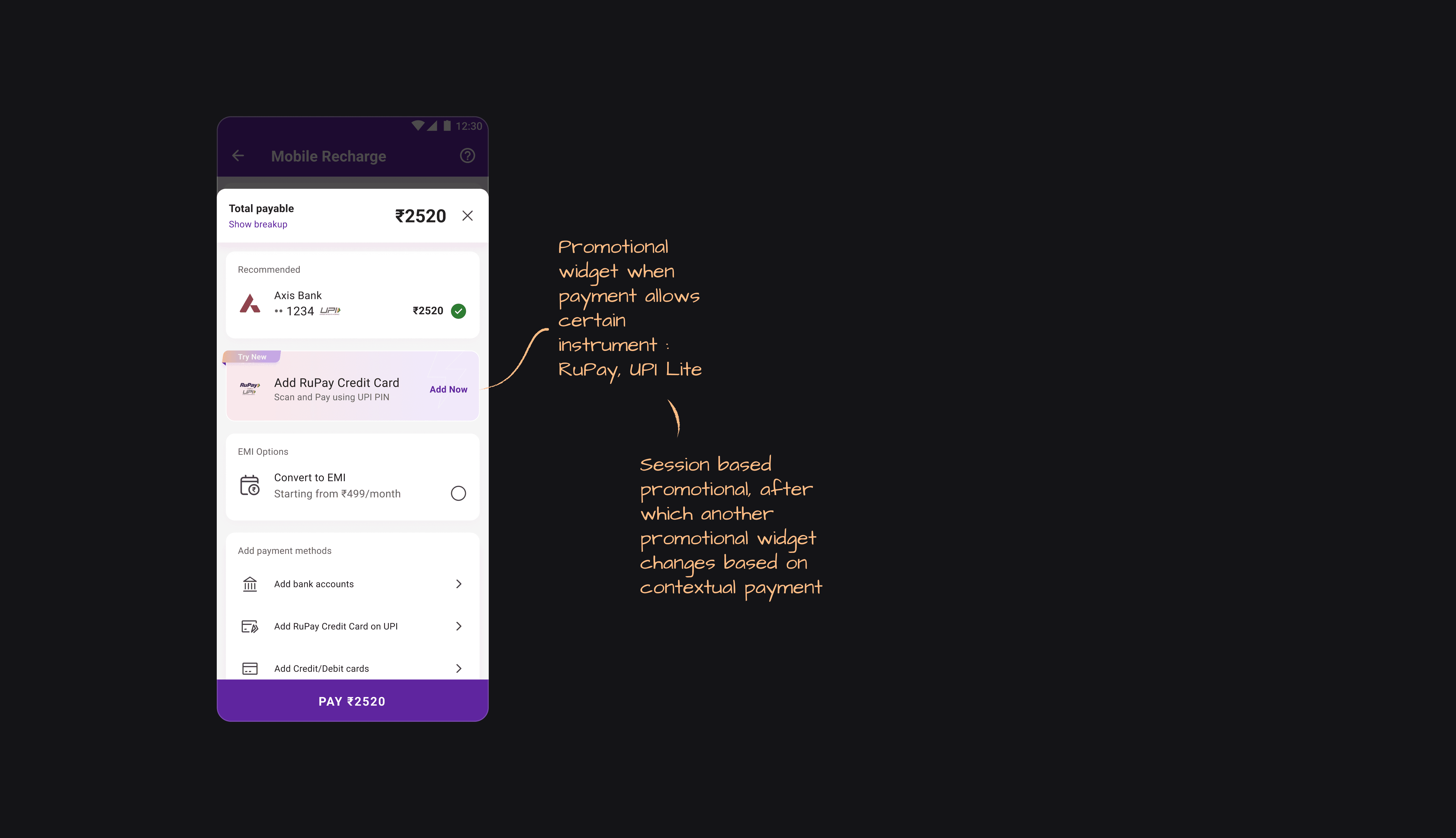
Decision 4 : Promotions Without Disruption
Promotions were introduced directly on the pay page, but with strict rules:
Only one promotion at a time
Contextual to payment
No redirects out of flow
Cool-off periods enforced
This enabled discovery without harming trust.
Execution & Collaboration
To ensure smooth rollout:
Created staging components for the PBS environment
Enabled faster iteration and tweaking during development
Collaborated closely with:
Android (Preet)
iOS (Sudeep)
Continuous feedback loops during build and testing ensured on-time delivery
UI & Implementation Challenges
Network logos (RuPay, Visa, Mastercard, UPI) varied in size
Existing tag system caused visual imbalance
Rollout, feedback & Iterations
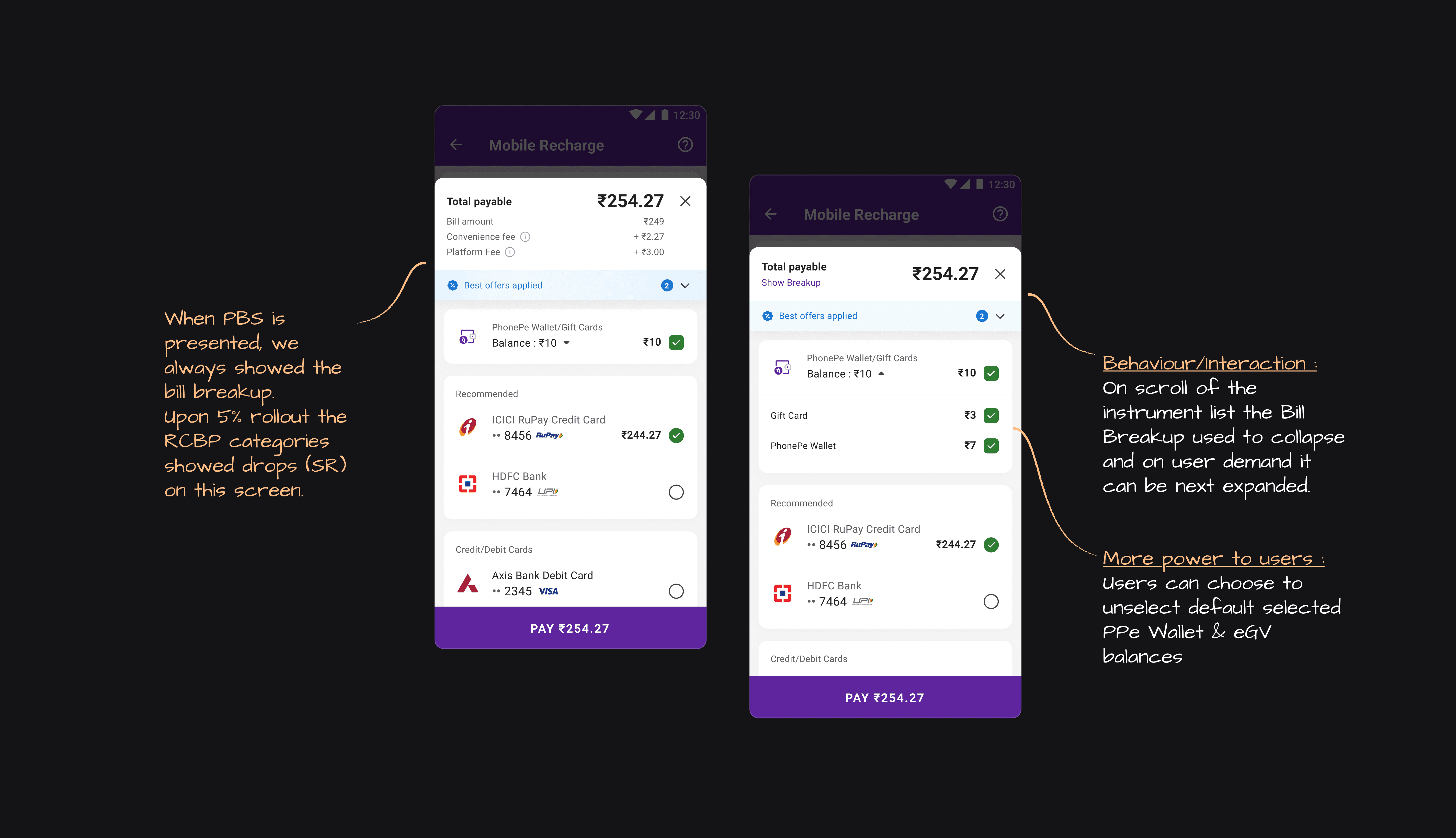
Initial 5% rollout showed transaction growth
Slight drop observed in RCBP categories
Feedback from leadership highlighted:
Spacing issues
Bill breakup visibility (PF / CF) affecting behaviour
Iteration included:
Adjusting spacing
Revisiting bill breakup exposure
Introducing discounts on convenience fees
Outcome & Impact
50% adoption of the new Payment Bottom Sheet
0.19% monthly increase in transactions
Contributing ~8 million additional transactions per month
(Metrics are directional)
Learning & Reflections
In payments, defaults beat choices
Ranking + recommendation outperform education
Systems thinking scales better than UI iteration
The pay page is a policy surface, not just a UI surface