Enter Password
Credit Cards on UPI
Card Distribution
Year
2024-25
Type of Project
Credit Cards - Cobranded
Company
PhonePe Pvt Ltd
Worked as
Lead Product Desginer

Case Study
Summary
PhonePe is a UPI-first platform where transaction scale and reliability are critical. With RuPay credit cards becoming interoperable with UPI, entering the co-branded credit card space became a natural extension of the payments ecosystem.
This case study covers the program-level design of PhonePe’s co-branded credit cards, focusing on how multiple card variants were launched and scaled through a shared application, approval, and management system.
Role & Responsibility
As the Lead Product Designer, I was responsible for taking PhonePe’s credit card distribution from 0 → 1, as this was the company’s first entry into the credit card business.
My responsibilities included:
Owning end-to-end experience design for credit card distribution
Partnering closely with Product, Engineering, and Business
Mentoring another product designer who worked alongside me
Given my prior experience designing RuPay credit card integrations, this project closely aligned with my earlier work and allowed us to move faster while handling new constraints.
Key execution areas:
Product Detail Pages (PDPs)
Pre-issuance flow
Card upgrade / downgrade flows
Post-issuance card management journeys
Overview
PhonePe partnered with multiple banks to launch co-branded credit cards that served different user segments and business goals.
Card portfolio at a glance:
HDFC Bank: Mass and Premium variants
SBI Card: Mass and Premium variants
Utkarsh Bank: FD-backed credit card
While each card differed in positioning and eligibility, they all shared:
A common discovery and application system
Unified verification and approval logic
A shared post-issuance management experience
This approach allowed PhonePe to scale credit cards without building isolated systems for each partner.

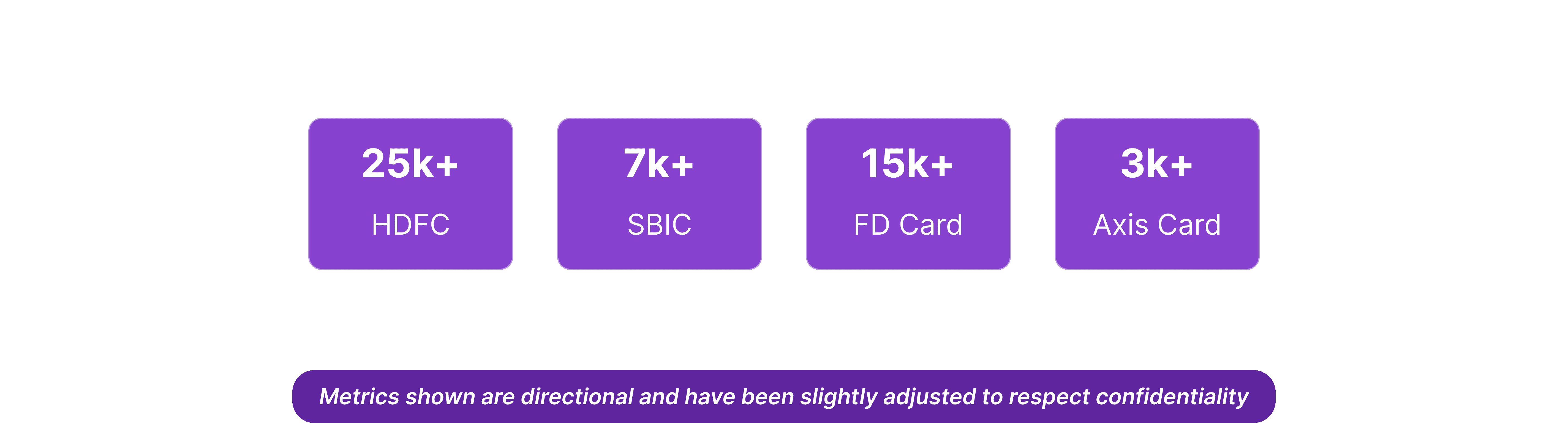
Impact
Program launched in July'25
By December '25, ~1 lakh credit cards issued (making PPe 2nd in rank to issue cards)
HDFC led initial adoption due to early rollout
SBI and FD-backed cards followed as secondary launches
Context & Scale
This was not a single linear flow, but a long, state-based journey with multiple paths depending on:
User type
ETB (Existing-to-Bank users)
NTB (New-to-Bank users)
Bank responses and verification outcomes
Regulatory and risk constraints
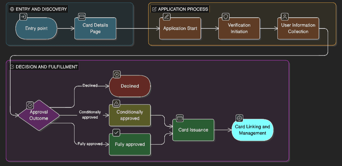
The journey spanned
Discovery and eligibility (including DRE handling)
Application
Verification
Issuance
Post-issuance management
Additionally, the system had to support:
Multiple entry points
Resume states across sessions
Post-issuance actions (limits, upgrades, usage visibility)
Problem Statement
Users expect credit card applications to be simple and predictable, but in reality, credit systems are asynchronous, regulated, and failure-prone.
The core challenge was to design an experience that:
Felt simple and trustworthy to users
Handled complex backend states and bank-driven logic
Reduced drop-offs caused by uncertainty and unclear outcomes
This was not just a UI problem, but a system-level design challenge involving trust, timing, and transparency.
User Behaviour & Mental Models
Users approached credit cards with uncertainty and anxiety, especially first-time applicants.
Key behavioural patterns observed:
Users wanted constant reassurance during the journey
Progress visibility mattered more than speed
Unclear failures led to abandonment
Stage
Emotional State
Entry & Discovery
Curious • Hopeful
Application Start
Cautiously Optimistic
Verification
Anxious Uncertain
Decision & Outcome
Relief • Disappointment • Confusion
Post-Decision
Trust Rebuilt • Drop-off
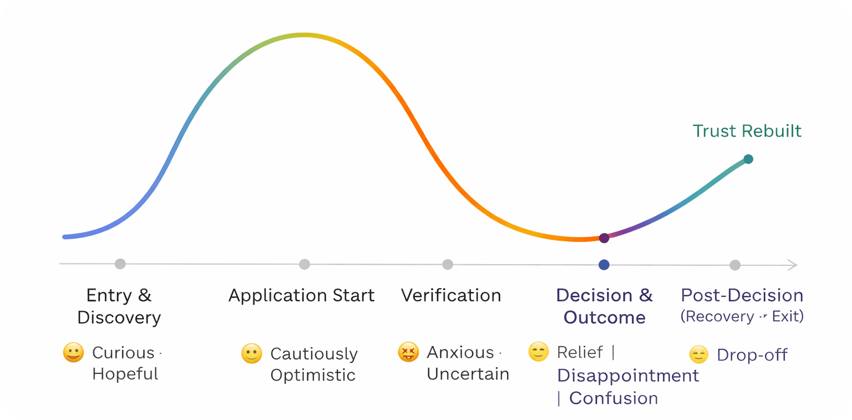
"User behaviour showed increasing anxiety as the journey progressed, with reassurance and progress visibility becoming more important than speed."
Signals seen across the system:
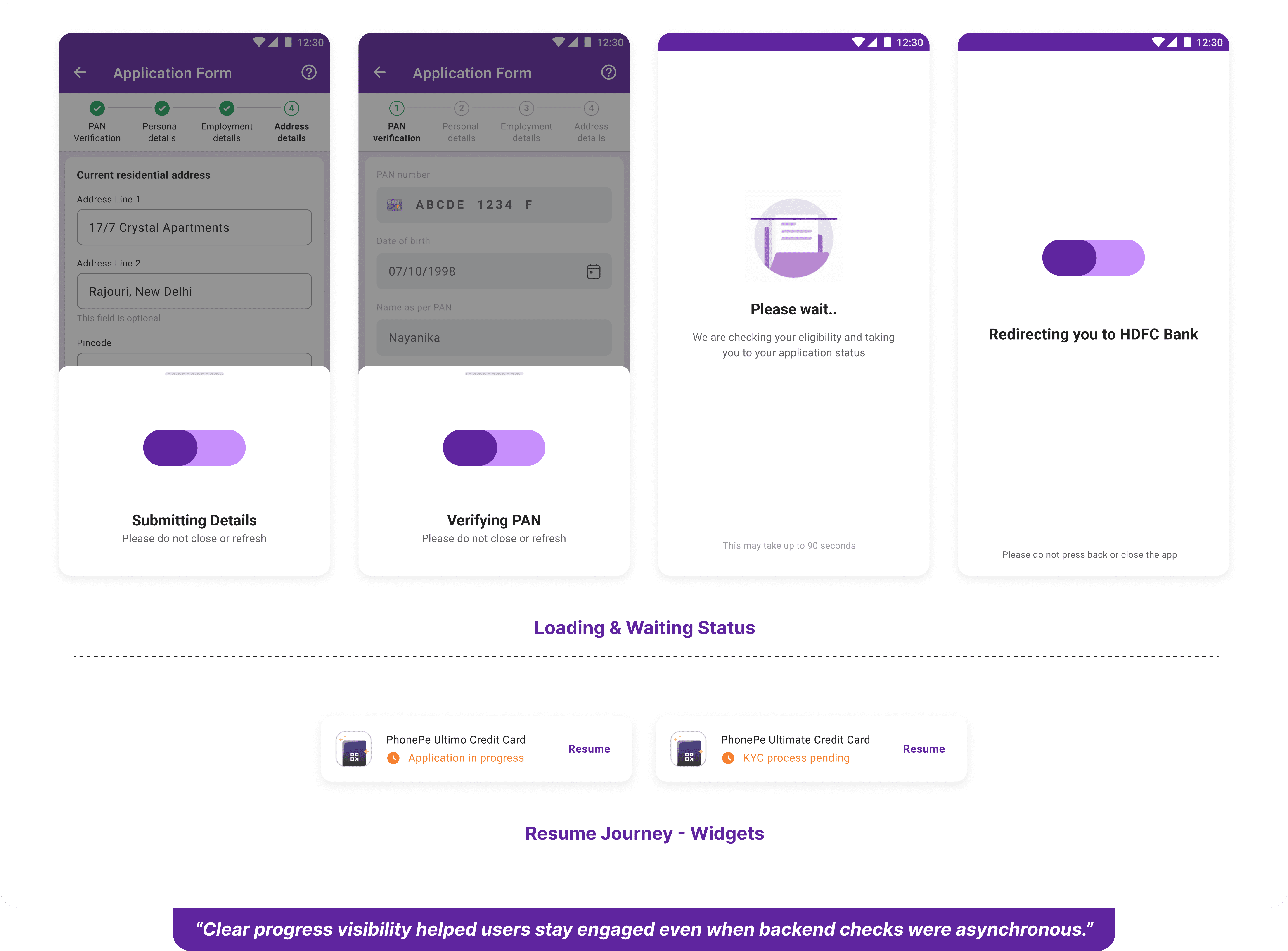
Resume journeys
OTP retries
Error handling patterns
Decline messaging
Time-based purging
FOMO-based fee waivers
Core pain points:
Fear of rejection
Confusion about eligibility
Lack of understanding of banking logic
High sensitivity to ambiguous states
Insight 1 : Users wanted constant reassurance
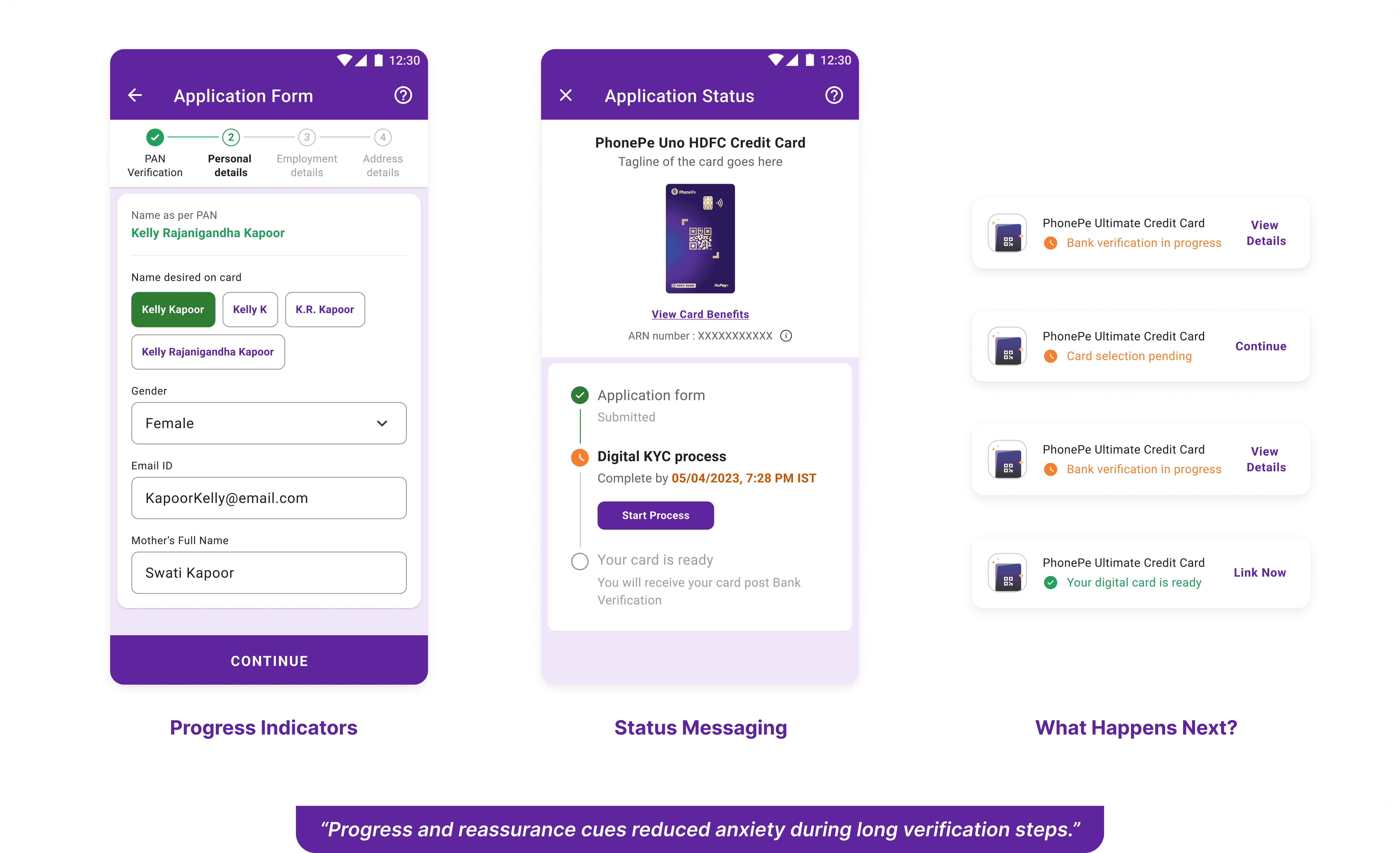
Insight 2 : Progress visibility mattered more than speed
Insight 3 : Unclear failures led to abandonment
Constraints & Roadblocks
Platform constraints:
PhonePe’s LiquidUI required foundational tweaks to support complex credit journeys without breaking consistency.
Aggressive timelines:
This was a BAU-critical launch with limited room for iteration before go-live.Third-party dependencies:
Bank-controlled flows and responses constrained real-time UX decisions.
Injecting alternate methods for delight elements for users even with constraints from tech:
Key Decisions
Each decision balanced:
User trust vs business goals
Transparency vs cognitive overload
Speed vs reassurance
Platform constraints vs experience quality
Decision 1: When to Surface Eligibility
Problem:
Surfacing eligibility too early increased anxiety and drop-offs, while delaying it risked wasted effort.
Decision:
Eligibility signals were progressively revealed, only when users had sufficient context and intent.
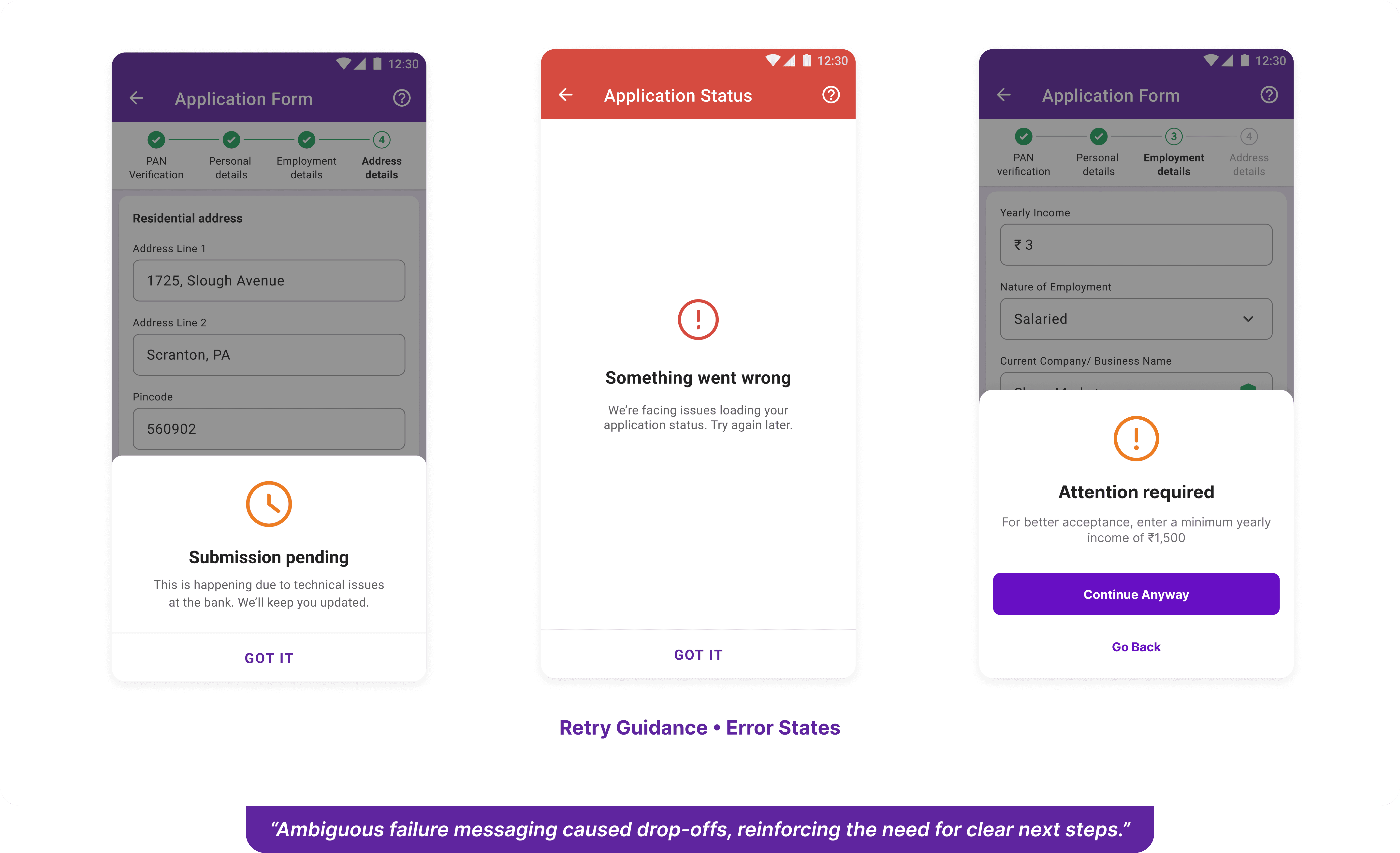
Decision 2: Designing Decline as a State, Not an End
Problem:
Hard rejections caused abrupt exits and loss of trust.
Decision:
Decline states were designed with clear explanation, and also used later for cross-selling secured credit cards.
Decision 3: What to Hide vs What to Show
Problem:
Showing everything created overload; hiding too much reduced trust.
Decision:
Only actionable and reassuring information was surfaced, while system-driven logic stayed behind the scenes.
Trade-off:
The experience felt simpler, even though the system underneath was complex.